Yahoo UI Grids: CSS Templates In A Nutshell
UPDATE 2007-09-09: Pretty much everything below this paragraph is now misinformation. I've laid out my site with Yahoo UI Grids and posted a brief, uninformed review at http://www.pseale.com/blog/YahoosUIGridsIDidntReadTheInstructions.aspx.
Yahoo's UI Grids layout is precisely 750 pixels wide, give or take precisely 0 pixels. If you're targeting a wide audience and really working to reach the low-end, this CSS template collection is far better than anything you or I could come up with--it's the perfectly good solution. But I'd like to, uh, maybe use more than precisely 750 pixels.
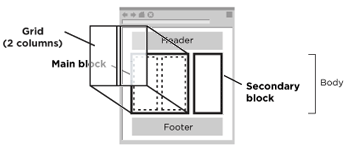
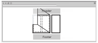
Let's try this visually:
Yahoo's concept of a standard user's browser window:
My concept of a standard user's browser window, circa 2007:
So I'm using tables for layout. Sorry.
Here's the link to the site: Yahoo UI Grids
 Peter Seale's weblog